Astute readers may have noticed the renovation I’ve been doing over the site for the past few days. Well, okay, probably anyone that came to the site and had seen it before probably noticed. It’s a pretty big change, and while I was pleased with the previous look of the site, I think this facelift makes it both more modern in look and more functional as well. The main thing that isn’t functional right now is the Page Navigator at the very top of the site. (That seems to be a programming issue and I’m working with the theme designer to resolve it. Hopefully in the next few days.) If you really need something up there, e-mail me and I’ll tell you the “secret” for getting those pull-downs to work. Until then, you can use the brand-new post navigator to find your favorite blog topics (which I now know they call “categories” in WordPress land).

And after all the time I spent straightening out my blog posts and putting them into categories, I certainly hope you like ’em! I hope you like the site redesign as well. Why not drop me a line and let me know — or, leave a comment on this blog entry. (That’s an old feature, but easier to find now, I hope.)
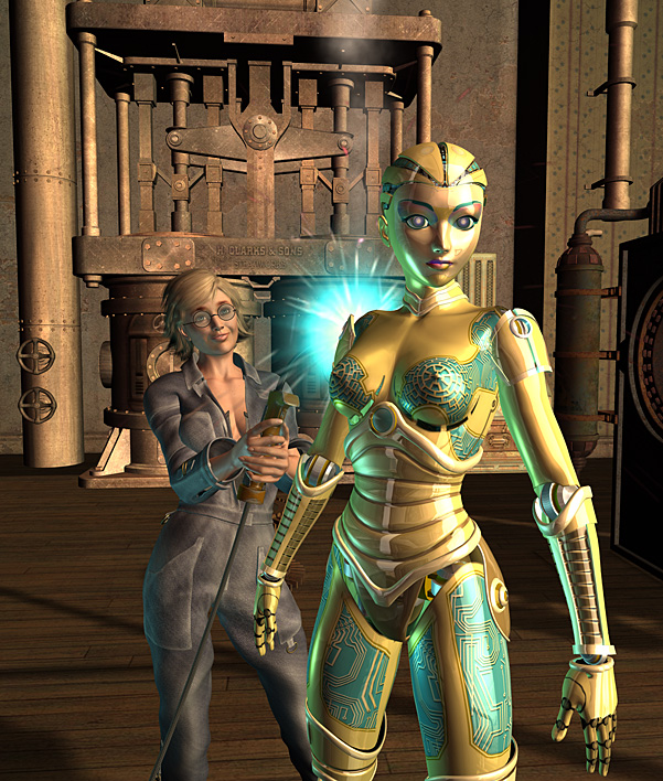
And, just to reward you for being so patient for having to put up with all this dust and new-paint smell, I’m sharing an “alternate cover” for my steampunk story “Automata Futura” — a story you can read right now in the Hot & Steamy anthology. Enjoy, and don’t forget to write!


